I have elaborated a rather complicated tournament with the top 24 contenders, as I see them. There are 8 first round matches in two brackets featuring, of course, 16 flag carriers. There are 8 flag carriers with a bye, which shall be called "Old Europe." They are British Airways, SAS, Iberia, Lufthansa, Air France, Swiss International Air Lines, Alitalia, and KLM. The winner of each of the first round matches will advance to play a member of Old Europe. After that, we will be in a traditional 4 round bracket plus the final.
Onward and upward...to the First Round Matches...(Parentheses indicate next opponent)
A Bracket
Austrian Airlines v. Brussels Airlines (British Airways): I knew I was going to get a lot of white-based color schemes here - so it's no surprise that the first match offers two similar designs. I go with Brussels Airlines here for two reasons. First, the dark tail offers some contrast. Second, I like both the bubbled "b" and the all-lower case lettering. Now that's interesting. WINNER: Brussels Airlines.
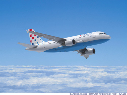
Bulgaria Air v. Croatia Airlines (SAS): So we are 2-for-2 in the white-based color scheme matches. We have a case here of two airlines using their national flag colors. The winner here is pretty clear. Croatia Airlines very nicely incorporates the Croatian checkerboard into the tail design and at least breaks up all the white on the fuselage with the light blue on the underbelly. If this keeps going it's going to get pretty hard to pick between shades of white. WINNER: Croatia Airlines.
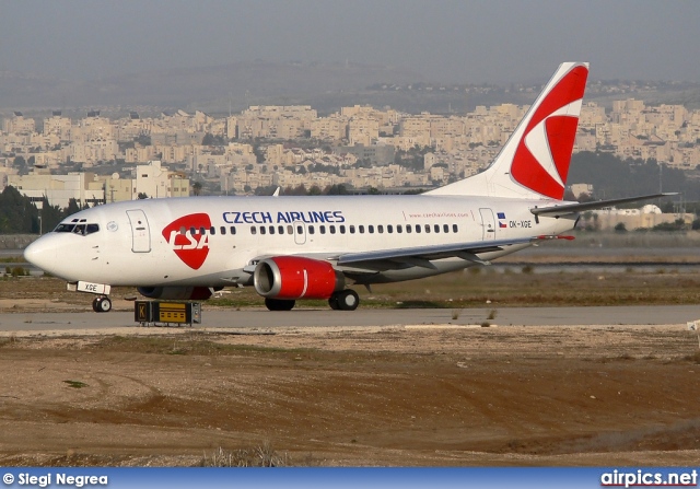
Czech Airlines v. Finnair (Iberia): Look, Mommy, two more white planes. So it continues...I'm sorry Finnair, but I could not get over the backwards "f" on the tail. I understand why it happened - because when you look at the other side of the plane, the "f" reads correctly. And, at first I was drawn to Finnair because of its uncanny resemblance to Aerolineas Argentinas' color-scheme. But I just couldn't get over the backwards "f" - it looks like assinine. WINNER: Czech Airlines.
 Olympic Airlines v. Malev - Hungary (Lufthansa): Finally, we have a little splash of color in this competition. It's hard to find anything wrong with Olympic - the Olympic rings are very neatly arranged on the tail and the Greek flag is very subtly added to the front of the plane. Very traditional and easy on the eye. I was a little surprised by Malev because the nose cone is painted dark. It was actually a little distracting. WINNER: Olympic.
B Bracket
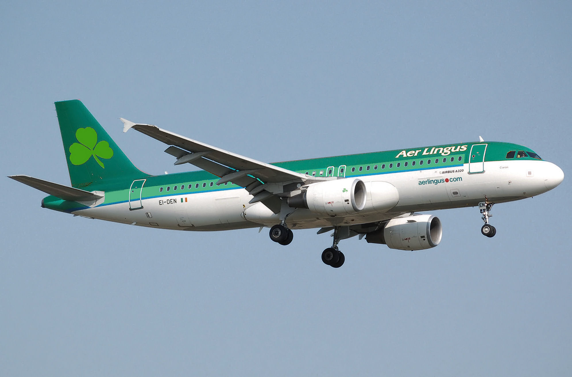
Icelandair v. Aer Lingus (Air France): Finally there is a bit of color in this competition. These are both among the most dynamic color-schemes so far in the tournament, and I would imagine that if these had not been paired against each other in this round that both would have advanced. I am leaning towards Aer Lingus on this one, even though "Air" is apparently mispelled on all their planes. Green is certainly an unusual color to see so prominently on an airplane, but it looks slimming. Also, Icelandair reminds me of Boca Juniors jersey. WINNER: Aer Lingus.

*Note: My research intern informed me that "Aer" is not actually a mispelling, but is actually the way the Irish spell "Air." Apparently, both are pronouced "Air."
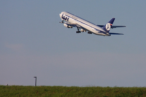
LOT Polish Airlines v. TAP Portugal (Swiss International Air Lines): In Europe, they call this rivalry the Battle of the Acronyms. Who knows what all those capitalized letters mean, but we can all be sure it's something clever and patriotic. And I am going to guess that the "P" in "TAP" means Portugal. That would also imply that the name of that airline is "Something something Portugal Portugal." That's silly. And in this competition, silliness can be fatal. WINNER: LOT.
TAROM - Romania v. Air Slovakia (Alitalia): Thank goodness, I'm back to picking between different shades of white again. I have a soft spot in my heart for baby blue, so my first impression was to go with Air Slovakia. However, I also became obsessed with the obligatory eagle-like figure on TAROM's tail, and then also moderately interested in the fact that the image also appears on the winglet and engine. Possibly also on the toilet seat, but I could not confirm that. WINNER: TAROM.
Adria - Slovenia v. Ukraine International Airlines (KLM): At first glance, the design on Adria's tail looked like a moth to me. Then I realized that it was an "A" and it's reflection. Then I paid even closer attention and realized that the "A" on the tail is in the same font as the "A" on the fuselage but that they are leaning in different directions. I didn't know whether to penalize Adria for inconsistency or reward them for technical accuracy, metaphysically speaking. Ukraine did not present a similar controversy. Their color-scheme is reflective of the national colors and does not contain mispellings, as far as I can tell. Sometimes that's all it takes. WINNER: Ukraine.
Time for Round 1 1/2. All first round winners must now face the members of Old Europe that received a bye. Winners of this round make it to the continental Elite Eight.
Bracket A
Brussels Airlines v. British Airways: Although I liked the folksy charm of the lower-cased lettering on Brussels Airlines, it does make the color-scheme looks somewhat amateur next to the graceful floating ribbon on BA. And I must admit that even though I have grudge against Britain and by extenstion all things British after their pirate-like war against Argentina, I have always found the color-scheme on British Airways to reflect the grace of Queen Elizabeth. WINNER: British Airways.
Croatia Airlines v. SAS: It should be noted here that Scandinavian Airline Services (SAS) represents Denmark, Norway and Sweden, also known collectively as "Scandinavia." While I was, and continue to be, impressed with the tail design on Croatia Airlines, I also believe that SAS should be awarded brownie points for consolidation. It is honorable for a country to rise above the need to have its own airline and instead develop one regionally. There is precedent for this - remember that in the North America Regional, AeroMexico won largely as a result of its environmentally-friendly polished finish. WINNER: SAS
Czech Airlines v. Iberia: I don't think I understand the tail logo on Czech Airlines. It means nothing to me. It looks like the CBS logo got hit by a hammer. There is a lot to like about the Iberia color scheme. There is also a lot to not like about it. Especially the fact that after Iberia purchased a majority in Aerolineas Argentinas they imposed this color-scheme on us. I never forget. WINNER: Czech Airlines.
Olympic v. Lufthansa: When I look at a Lufthansa plane, I think it is thinking this: "I am so goddamn good I don't even have to bother with an elaborate color-scheme." If a plane could exude confidence, it would look like Lufthansa. Don't get me wrong, there is nothing wrong with Olympic, but Lufthansa is just that good. Lufthansa planes don't taxi around the jetway. They strut. WINNER: Lufthansa.

Bracket B
Aer Lingus v. Air France: This match is difficult because we have a case to two flag carriers that very appropriately capture the national spirit of the countries they represent. The shamrock on the one hand is so traditional, and of course the predominance of green on Aer Lingus does not hurt. On the other hand, I was very moved when the tail of the A330 that crashed off the coast of Brasil was recovered. That was all one needed to see to know what had happened. When an image can conjure up an entire identity, then that is a successful color-scheme. WINNER: Air France.
LOT v. Swiss International Airlines: Swiss is almost too predictable. I know that using national symbols is a criteria in this tournament, but you have to do something other than pasting your flag on the airplane's tail to win. I do like that Swiss spells out the country's name in each of the country's official languages. That is certainly very unique. However, I just also noticed a subtlety about LOT - the stripe that runs along the fuselage is continued right below the cockpit. There's something about it that is appealing to me. WINNER: LOT.
TAROM v. Alitalia: There are two details about both of these color-schemes that I really like. On TAROM, I am strangely OK with the fact that the circle on the tail is not closed. But I am even more interested in the dark nose on the Alitalia color scheme. That takes me back to my childhood. I used to always draw planes with the dark nose cone for some reason. Probably because of some old Aerolineas plane that I saw at some point. The dark nose cone, in my mind, give Alitalia an old-school look. I like it. I like it a lot. WINNER: Alitalia.
 Ukrainian International v. KLM: Like I have said before, I have a strange attraction for baby blue airplanes, if it's done in good taste. On KLM, not only is the baby blue pulled off, but the dark blue stripe below it complements it very well. The I even like how the crown over the lettering is simple. A rectangle, four circles and a cross. By the way, did you know that the Dutch prince is married to an Argentinean? There is nothing inherently wrong with Ukraine International, except that it is pretty boring when you look at it next to its competition. WINNER: KLM.
Now for the third round of play. Winners of this round head to their Bracket Final, which is also the Continental Final Four. If we're lucky, this whole thing will be settled by October.
Bracket A
British Airways v. SAS: As much as I dislike admitting that the British do anything well, you know, after that whole war issue we had with them in 1982, I have to say that I have been incredibly impressed with the new color scheme ever since it debuted. I have never seen anybody else pull off the banner/flag design on the tail and actually make it look like it's flapping in the wind. That is pretty damn impressive. SAS, I feel, made it this far on the strength of its moral high ground. So, kudos to you SAS, you're message of consolidation and minimalism has certainly been heard. But I am afraid that your color scheme is a boy in a man's world, or a girl in a woman's world - something like that. WINNER: British Airways.
 Czech Airlines v. Lufthansa: It is odd, but I have nothing nice to say about Czech. I really can't find a redeeming quality in the color-scheme right now. To add to my comment about Lufthansa from earlier - not only does Lufthansa exude confidence, but it has, by far, the best mandatory eagle-like tail design on any airline that I have encountered. Hands down. It's proportional, it's ascending, it has a crest. It's ridiculously handsome. WINNER: Lufthansa.
Bracket B
Air France v. LOT: To piggyback off my mandatory eagle-like tail design from above, I would say that LOT has perhaps one of the worst of any of the ones I have encountered. It just looks disheveled, and possibly dying. And although I have given a lot of grief to the predominantly white color schemes in Europe, I had to admit that for some reason it works on Air France - and after giving it much thought, I think it works because the tail has enough color to keep the eye happy. WINNER: Air France.
 Alitalia v. KLM: I admit that I may be a little picky here - but I am going to base this decision solely on how the color-scheme looks on the MD-11. The MD-11 has a third engine mounted on the tail, which can wreak havoc on a color scheme. Alitalia and KLM employ many MD-11's, and as such it is important that the color scheme on the MD-11 is consistent and appropriate. Accordingly, I am going to have to go with KLM. Alitalia has to break up the green streak down the fuselage on the MD-11 which makes the whole concept of the streak irreconcilable. KLM has a color scheme that adapts well to the MD-11. There are no inconsistencies between what you would see on an MD-11 and what you would see on any other member of the KLM fleet. WINNER: KLM.
Now, for each bracket final...the winner of the next two matches will meet in the Continental Final to determine who will represent Europe at the Big Dance.
Bracket A Final
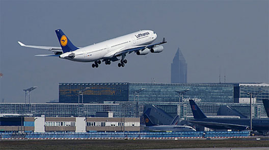
British Airways v. Lufthansa: The tail design on both of these airlines is very impressive. It is, for all intents and purposes, a draw. The kickass eagle thingy and the wavy banner. Very impressive and well done to both. So if we are having to decide this based on factors other than the tail, then I have to go with Lufthansa, I think. I recently began to think that the ribbon on BA is a bit superfluous and I have yet to see the point to it. It is not horrendous, but it does remind me of the Forrest Gump feather - just a floating thing with no purpose or reason to exist. WINNER: Lufthansa.
 Bracket B Final
 Air France v. KLM: At this stage in the game, even the smallest thing can get you tossed from the tournament. Air France certainly pulls off the white-based scheme. And as I mentioned before, the stripes on the tail are so immediately recognizable. However, I do have a bone to pick with the stripes - they do not begin at the base of the tail. For what reason, I do not know. KLM is certainly the exception to the rule in Europe. In a world of white, safe and traditional, it went with blue and bold. WINNER: KLM.
 So, three months later, here we are at the Final. I have judged on so many things that I can't even imagine what the final decision will come down to. Perhaps the design on the seats, or the smell of the bathroom.
European Final
Lufthansa v. KLM: As I begin to type this, I really do not know who will win this match. As much as I have praised both of these giants, there are still things about them that I have concerns with. For example, is Lufthansa's tail design alone good enough to warrant a spot representing this continent? And should KLM be punished or rewarded for not using orange, the traditional color of the Netherlands, in it's color scheme? I don't know. Maybe we will never know the answers to these questions. I can tell you this, however, this is a battle royale. The winner of this match could very well dictate the future of European color-schemes. Will the traditional white-based color schemes be validated by a Lufthansa victory? Or, conversely, will the continent abandon decades, centuries, of tradition and instead roll over to the modern need for new and bold color schemes? These are questions that neither you nor I have the time to hash out on these pages. These questions shall be left to the scholars of airplane color-schemes. For our immediate purposes, I will represent my generation and validate KLM. They have been alone in the frontier of major European carriers in rejecting the same old white-based color schemes. Have they been right to buck tradition? I don't know. But I do know this - somebody, anybody, always has to be bold enough to be the first to do something. The first woman to demand the right to vote. The first African American to play baseball. The first hockey team from Florida to win the Stanley Cup. It takes courage. And America values courage. So it is fitting that we here value and commend KLM for their courage to think outside the box. WINNER: KLM.

3 comments:
I would have come down to exactly the same final two . . . but I'd have gone with Lufthansa as EuroChamp. I like a bird that struts.
It was not an easy decision. Lufthansa is the raven of the color-schemes
Oh man, you blew it. You have some kind of a weird fixation on LufThansa... too bad, because Olympic takes Luf in the earlier rounds and i would say wins going away... Luf is plain jane. Olympic not only has the theme on its side, but the whole thing flows, http://www.planespotting.nl/a300/SX-BEM.jpg and as you know flow is so important in work of art, in the design of a cyclocross course, and in life.
Post a Comment