In
July 2008, I began an installment called the Best Color Scheme Among Flag Carriers Tournament. I envisioned it as a summer project. More than 2 years later, here I am - trying to finish out this damned thing. Just to refresh your memory, because god knows I needed my own memory refreshed, I picked a winner from eight regions with all the winners advancing to a huge Elite Eight tournament to determine once and for all the best color scheme among flag carriers. Today is the final qualification tournament as we (I) select the US representative to this elite field.
As you know, America does not have a flag carrier, since, you know, that sounds communist. So today we are picking the US winner from a group of 16 airlines (including 2 defunct, yet classic US airlines - PanAm and Eastern).
There are two 8-airline brackets seeded as follows based on numerous factors, including regional balance, yearly passenger load, and other factors that I, as commissioner, determined but do not have to divulge. Here are the brackets:
South/West Bracket:1. Southwest (appropriately enough)
2. American Airlines
3. Eastern Airlines
4. US Airways
5. Northwest
6. Allegiant
7. Hawaiian
8. Alaska
North/East Bracket:1. Delta
2. United
3. PanAm
4. Continental
5. Spirit
6. Air Trans
7. JetBlue
8. Frontier
So...onto the work at hand. Let's start with the
South/West Bracket:Round 1 Matches:(1) Southwest vs. (8) Alaska: I dislike having to make difficult decisions and already I have been saddled with a tough choice. One the one hand, the Southwest colorscheme is pleasing to my eyes - but it also seems quite loud to me. And while the Alaska colorscheme is simple, it still does just enough (like having lines of different widths running down the fuselage) to keep my attention. I am also fascinated by the Eskimo on the tail. I am going with Alaska on this because in the end, I don't think I like the wavy blend of red and blue on the southwest fuselage. I don't get it - why can't they have a straight line where the colors meet?
Winner: Alaska. (4) US Airways vs. (5) Northwest:
 There are things to like about both of these color schemes. Although US Airways has the basic white color scheme, there is a lot of activity around it. I am a huge fan of the subtle gray that Northwest uses - and I really like the lower case "nwa" that they use here. It's a nice touch. The only part of the US Airways color scheme that I am not getting is the block of red at the top of the tail. It is out of place.
Winner: Northwest. (3) Eastern vs. (6) Allegiant:
 I have always had a soft spot for Eastern since that was the airline that brought us to America. So even though it no longer exists, I thought that they merited a spot in this important tournament. I also am a big fan of Allegiant since they are the only commercial airline to fly in and out of Fort Collins. In this case I am going with Eastern because I believe they need to be rewarded with the fuel-saving and Earth-friendly polished color-scheme. Being green pays off, people.
Winner: Eastern. (2) American vs. (7) Hawaiian:
 Props for the polished look that American uses (see above). But American is not advancing simply because of the polish - it's also advancing because of the fine eagle on the tail and the great font. And Hawaiian - I am sorry but that lady on the tail is cartoonish. For reference on how to put an acceptable face on an airplane, see Airlines, Alaska.
Winner: American. Round II Matches:(8) Alaska vs. (5) Northwest:
 There certainly is a charm to a simple colorscheme such as the one used by Alaska. The problem with that, as I see it, is that it can result in a less dynamic appearance. Take Northwest's old color scheme (see it
here): it was exciting and "busy." But when the time came for a new look, Northwest was able to adapt and come up with a new look that preserved the heritage of the old colorscheme. I am fascinated with how Northwest adapted the tiny triangle in the N/W on the tail and used it as the main point of attention on the new colorscheme. I think that although the Alaska colorscheme is certainly attractive, it has nowhere to go from here. On the other hand, I am excited to see what Northwest does next. As a side note, props to Alaska for some very well crafted special colorschemes, like the Salmon Plane below.
Winner: Northwest. (2) American vs. (3) Eastern:
 It is fitting and good for the environment that these two eco-friendly color schemes have advanced this far. Despite the significant similarities between these colorschemes, there are, in fact, substantive differences. First, the stripes on the Eastern fuselage rise through the tail at the back of the plane. That is not a very aesthetic look in my mind. On a similar note, while American sports the AA and eagle on the tail, there is nothing new or unique on the Eastern tail.
Winner: American.Round III: South/West Bracket Final(2) American vs. (5) Northwest: This final has come down to a battle between two different styles. While Northwest was praised for its dynamic colorscheme, American has advanced largely on its ingenuity and classic symbols. And, ultimately, that is where I make my determination - the symbols. The American tail is distinctive and recognizable. Not to take anything away from Northwest, but sometimes the price you pay for product rebranding is a loss in identity. And what is more important than identity in a colorscheme?
Winner: American.

Now it's time for the North/East bracket. Here we go with...
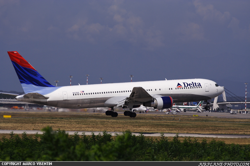
Round I Matches:(1) Delta vs. (8) Frontier: Perhaps in a preview of what may be coming in subsequent rounds, I am just going to have to put out there that I have a slight problem with the Delta flag on the tail. I can see how the country's flag would be helpful on an airplane, but I don't think a "company" flag is appropriate. That being said, although I have shown some love to the hint of gray earlier in this post (see Airlines, Northwest), I am not a fan of the large, fuselage-encompassing soft gray used by Frontier. But the animals on the tail are cute and they made for
some good commercials back in the day.
Winner: Delta. (4) Continental vs. (5) Spirit:
 I like both of these colorschemes very much. Continental offers a nice two-toned fuselage with a fine golden line to separate the colors. And it is hard to mess up the globe on the tail. Spirit - like others before it - very effectively uses the soft gray. I don't think their colorscheme would work well with a white background so I give them props for that. I go with Continental here though because I don't like how the square-fade works in the tail of the Spirit colorscheme.
Winner: Continental.
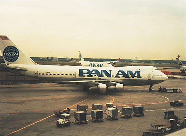
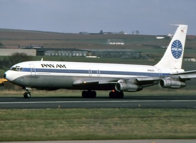
(3) PanAm vs. (6) AirTrans: There is a lot to like about the traditional PanAm colorscheme. The lettering is bold, and although similar in font and size to Frontier, it differentiates itself in that it is dark lettering instead of the light, almost "excuse me" lettering on Frontier's fuselage. And again, like I said about Continental, it is hard to mess up the globe on the tail. Huge props as well for writing the names of the planes near the cockpit. AirTrans essentially offers Southwest lite and I am not feeling it. The lower case "a" on the tail is a nice touch, but not nearly sufficient to knock off PanAm.
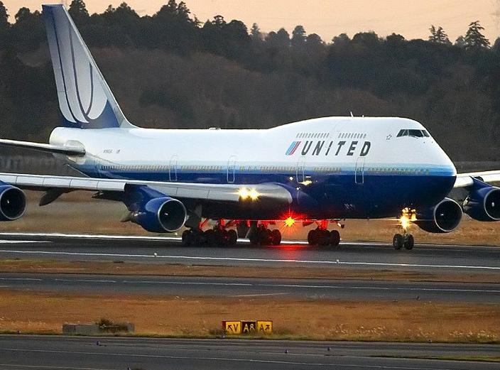
Winner: PanAm. (2) United vs. (7) JetBlue:
 This was a very one-sided contest for me. United's new colorscheme is pretty awesome by my estimation. And actually, I would even say that their previous two colorschemes have been
awesome and
awesomer. I have always believed that a great colorscheme is one that can evolve and retain the greatness of the previous design and incorporate that into the new colorscheme. By that yardstick, United has been very successful. There is nothing inherently wrong with JetBlue's colorscheme. It is pretty dull by comparison here, though.
Winner: United.
Now...on to
Round II Matches:(1) Delta vs. (4) Continental: I am somewhat conflicted here because I genuinely don't have major issues with these colorschemes. Sure, I made some disparaging remarks about the flag on Delta's tail earlier - but in reality the design is well laid out. Upon some research into the Continental colorscheme, I did find that I do not like how it looks on the Boeing 757 - which is my favorite plane at the mo'. Just like a great colorscheme must be able to evolve, it should also look good on the planes you fly. The problem with the Continental colorscheme on the Boeing 757 is that it makes the plane look disproportionate. Look at the Boeing 767 here:

See how the gold line runs down the middle of the nose? Now look at the Boeing 757:

See how the gold line is higher than the middle of the nose?
Winner: Delta.
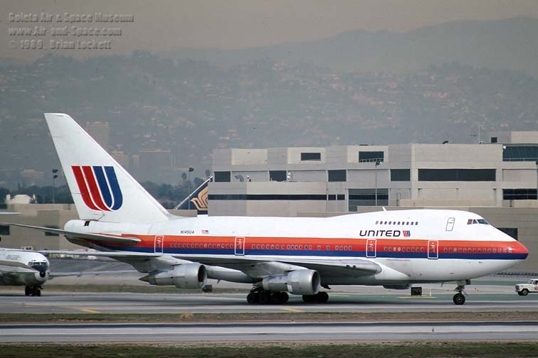
(2) United vs. (3) PanAm: Huge props to PanAm in this contest since it is the closest the US has come to a "flagcarrier." However, in this match up, I think PanAm bows out. If I had to pick one reason that United wins here it's the tail design - there is nothing wrong with PanAm's globe, but the United "U" is very imposing and, dare I say it, almost intimidating.
Winner: United.
And now for the
North/East Bracket Final:
(1) Delta vs. (2) United: I had not mentioned this earlier, but Delta does employ a partly-polished look on its planes' underbelly, which on these pages has been rewarded due to it's eco-friendliness. However, from a purely, purely aesthetic standpoint, the polished underbelly clashes too strongly with the white of the rest of the colorscheme. While I applaud Delta for it's partial green colorscheme, the artist within me must also punish them for an unbalanced look. Plus, if you're going to save Earth, you might as well go all the way.
Winner: United.So here we are at the final. East meets West. North and South will collide. Again. The winner advances to the big dance and will represent the US.
(2) American vs. (2) United: In a way it is very fitting that one of these airlines will be representing the US in the final tournament. Even in their names they embody the spirit of this country. These two airlines arrived here for different reasons. American has had a traditional look that has endured. And - yes, I am mentioning it again - the polished look helps. United has gone through various colorschemes even in my short lifetime - and each of the looks has been impressive. This is going to be a very difficult decision indeed. As I study both of these colorschemes closely, I am find it challenging to find a significant enough flaw on either of these colorschemes. In fact, I just keep finding pleasant surprises. For example, even the order of the red, white and blue stripes on American make sense. In any other order I am not sure if they would look that good. And the gradation and fade-in of the blue to white on United is very well done. The shades and sizes of the stripes are ideal. However, at the end of the day this is a competition about colorschemes on airplanes. The colorscheme that best suits airplanes should be the one that wins. While the polished look on American is beautiful and well complemented, I can't help but feel that the colors and variations on United help bring the different parts of the airplane out. American is like the naked human body with all its imperfections and faults. United planes are dressed up and ready to shine.
Winner: United.
And here are the eight finalists who will be competing for the title of
"Best Colorscheme Among Flagcarriers:"
South America: Varig
North America: AeroMexico
Oceania: Air Vanuatu
Middle East: Saudi Arabian
Asia: Thai
Africa: Air Tanzania
Europe: KLM
US: United
 I like how at the 0:24 mark after the plane has been skidding for a while (and has not yet veered off the runway or otherwise become destroyed) the flight attendant gives out a triumphant "Heads down! Stay down!" You can sense in her voice that they are gonna make it.


