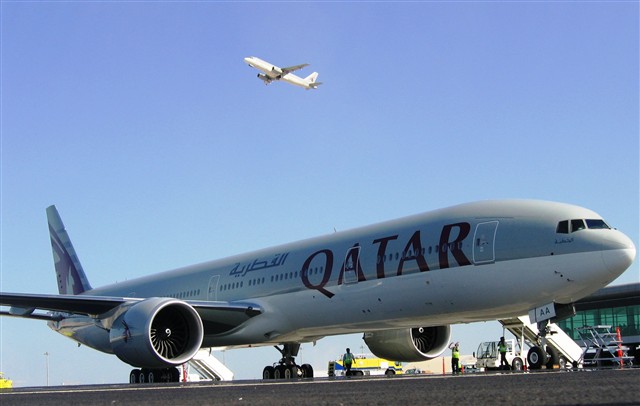
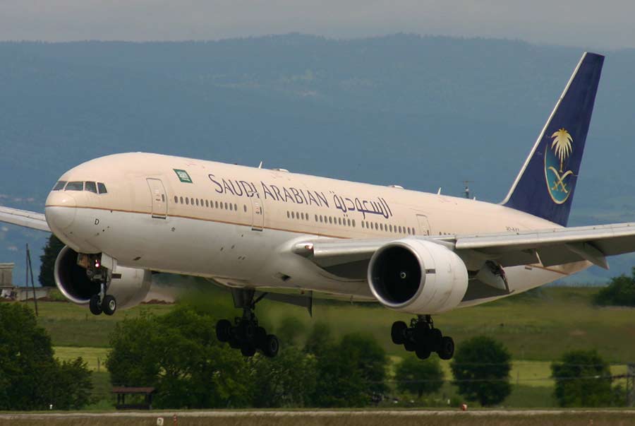
Anywho, I broke Asia up into four regions: West, South, East, and Southeast. There are four representatives from each region, one in each bracket as such:
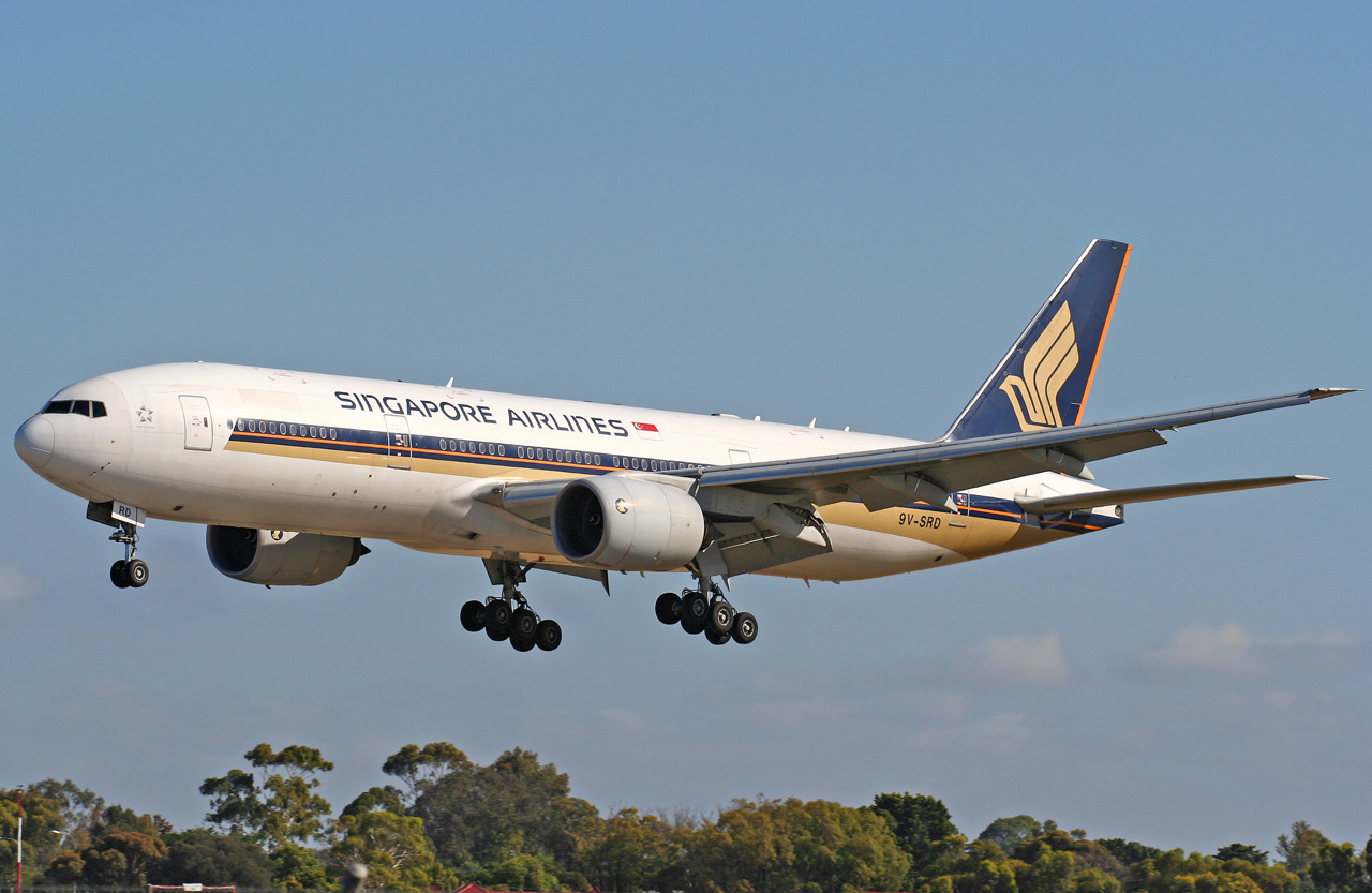
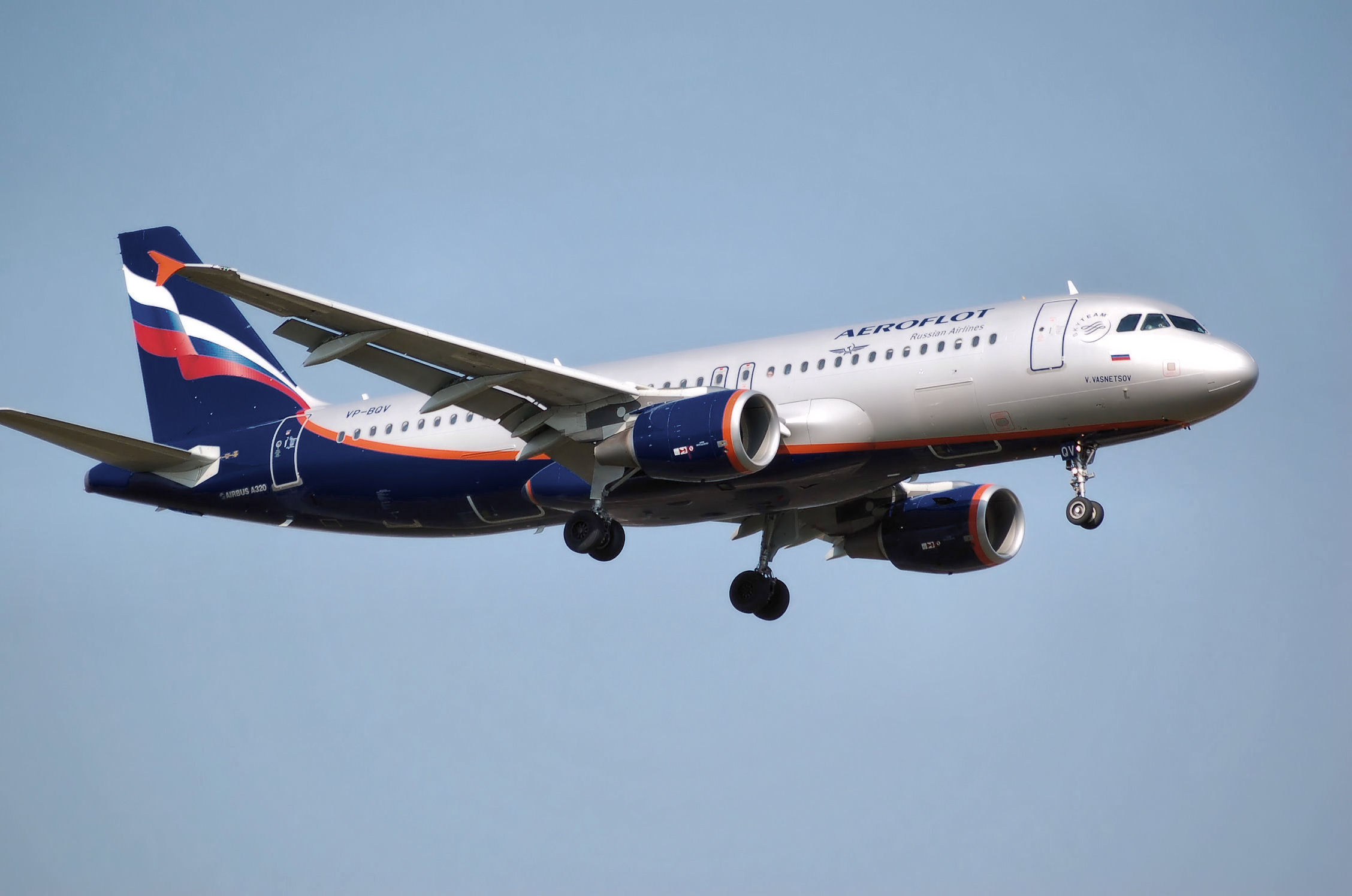
Bracket 1: Aeroflot (Russia), Air China, Pakistan International Airlines, and Singapore Airlines
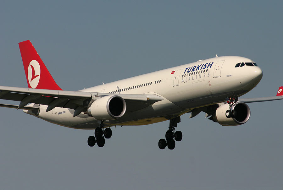
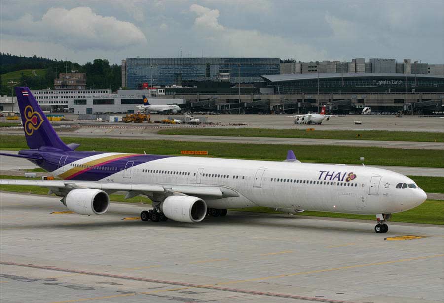
Bracket 2: Turkish Airlines, Cathay Pacific (Hong Kong), Armavia (Armenia), and Thai Airways International
Bracket 3: Air Astana (Kazakhstan), Japan Airlines, Air India, and Malaysia Airlines
Bracket 4: Uzbekistan Airways, Korean Air (South Korea), Ariana Afghan Airlines, and Garuda Indonesia
In addition, I included four wild cards, which will compete in a play-in round against the flag-carrier representing the country with the lowest population in each bracket. Let's go to the play-in matchups first:
Singapore Airlines v. Vietnam Airlines: This is a difficult match to judge. On the one hand, Singapore is one of the most successful airlines in the world, and I have a soft spot for them due to the fact that the first commercial A380 flew under their colors. However, this is not a popularity contest. Vietnam Airlines is the nerd to Singapore Airlines' jock in this matchup. But Bill Gates was a nerd. I am a big fan of the blue, so much so that I have the same shade in my bedroom.
WINNER: Vietnam Airlines. 
Cathay Pacific v. Phillipine Airlines: I have not hesitated to advance airlines with very simple color schemes. But, Phillipine Airlines is much too dull, especially when seen next to the very nice color combinations on Cathay Pacific. Even though it looks like the Cathay B747 is sporting a moustache, it still breezes through the play-in.
WINNER: Cathay Pacific. 
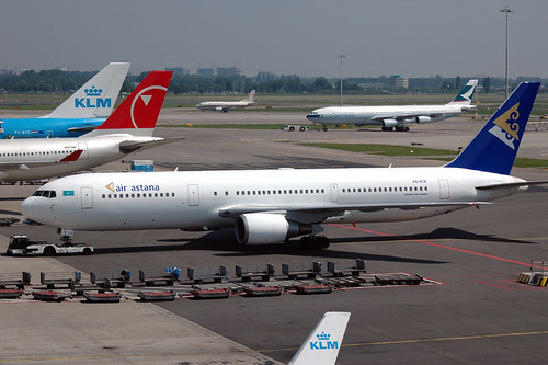
Air Astana v. Biman Bangladesh Airlines: Here is a choice between two predominantly white color schemes. Biman is not a fundamentally bad color scheme, and I actually like the crane like bird on the tail, but the fleur-de-lis for me is a symbol associated with
much goodness. And I really like how Astana has two of them superimposed on the tail design.
WINNER: Air Astana. 
Uzbekistan Airways v. Sri Lankan Airlines: On the one hand, we have, again, a rather pleasant white-based scheme. Sri Lankan has enough activity on the tail and the lettering to make the color scheme interesting. Although I am a big fan of the baby-blue on Uzbekistan Airways, why on God's good Earth is most of the color on the top of the plane where nobody can see it? Stop wasting my time, Uzbekistan.
WINNER: Sri Lankan Airlines. 
Now that the play-in matches have been completed, let's move on to the four brackets. I will play out the matches until we have the bracket winner. The bracket winner then moves on to the regional semifinal. On to Bracket 1...
Aeroflot v. Vietnam Airlines: This match could very well have been the Regional Final. Both of these color schemes are beautiful. Vietnam Airlines is just striking in every sense of the word. The gold livery jumps out of the blue background. Aeroflot combines a very classy metallic gray with an ornate and patriotic tail design. Notice how the red stripe on the fuselage becomes the red stripe on the flag. And matching engines to boot.
WINNER: Aeroflot.
Air China v. PIA: Every plane with Air China's livery that I have seen looks retro. It is an old school color scheme. I hate to say it, but this is what I would have expected from a Communist country. And that's not an insult in any way. At some point, they painted their planes that way, decided that they looked good that way, and kept it. Just like other stuff that Mao did. And, in a way they have a point. Color schemes do not HAVE to be changed all the time. It's sort of like these new businesses rising up that sell you cell phone ring tones. When did "Ring...Ring" stop being good enough? Long story short, Air China is not being punished for being old school. They are being punished by PIA's superior color scheme.
WINNER: PIA. 
BRACKET FINAL: Aeroflot v. PIA: Frankly, both of these color schemes are not entirely different. Both tail designs feature the nation's flag and there is an underbelly to roof motif on both. The beauty of Aeroflot is that it really makes its planes look sleek and missile-like. PIA is not an inherently poor design, but the ribbon-like stripe is simply no match for the totality of the Aeroflot color scheme. And, I just had the thought that with Pakistani food being served on those long flights to Karachi, the inside of the PIA planes have got to smell like curry big time. I don't think I could handle that.
WINNER: Aeroflot. 
Aeroflot moves on to the Regional Semis. Now for Bracket Numero Dos...
Armavia v. Cathay Pacific: Wow, I do not think I have seen a color scheme as colorful as Armavia's since Air Jamaica in the North American Regional. You might recall that at that point, I praised Air Jamaica for having a color scheme that stood out, but at the same time noted that even the Houston Astros eventually went to a less "loud" uniform. However, I don't see Houston Astros on Armavia, I see the Denver Broncos Orange Crush. Nicely done, Armavia. And, by the way, I have not been able to find any explanation for the moustache on Cathay Pacific.
WINNER: Armavia. 

Turkish Airlines v. Thai: The white-based color schemes have been either very disappointing or very nice in this Regional. Turkish falls into the "very nice" designation. I like the matching winglets and the two-tone lettering. Thai sees their bet and raises them a very intricate rear-fuselage livery with a fleur-de-lis-like tail design. These are two very nice color schemes, but Thai's extras overwhelm Turkish Airlines.
WINNER: Thai.
BRACKET FINAL: Armavia v. Thai: Continuing the football theme started in the first match of this bracket, I would say that Thai is the Minnesotta Vikings to Armavia's Denver Broncos. There is much to like about Armavia. For example, take a look at how they have created a "mountain range" on the fuselage and tail. And although the lettering is bold, it overwhelms the color scheme. Thai presents a balanced color scheme, which like a previous winner in this tournament, combines the elegance of a white-based scheme with an ornate and unique color combination at the rear of the plane.
WINNER: Thai. 
HALFTIME...Ok, now back to work. Bracket 3 is up next...
Air India v. Air Astana: Astana flew (get it?) into this round on the strength of it's tail design, which is not only very well finished, but also triggers a soft spot in my heart. I was skeptical that Astana would advance on the strength of the rest of the color scheme because it simply does not really have anything else going for it. Air India has the same problem that Air China did, and that is that it is too old-looking. Look at it...do not tell me that looks like a modern color scheme.
WINNER: Air Astana.
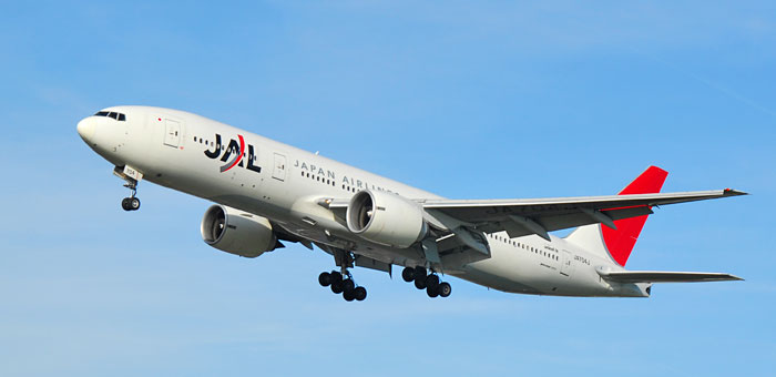
Malaysian Airlines v. Japan Airlines: Here is another matchup of white-based color schemes. Malaysian Airlines uses a simple red and blue stripe to highlight the white and I have no objections to the sting-ray like object on the tail. JAL's use of red creates a very bold look for it's aircraft. The red on the tail stands out magnificently, and like before, I have to express my approval of the two-toned writing on the fuselage. On a technical note, I would like to say that only the day-to-day color schemes are considered in this tournament for fairness sake. Many airlines employ one-time color schemes for special occasions or promotions. Malaysia and JAL are two of the best at it, as you can see below.
WINNER: JAL. 

BRACKET FINAL: Air Astana v. JAL: It comes down to this: these are two white-based schemes with nice tail designs. The difference is JAL's fuselage, which has two-toned writing and a well-placed red strip on the logo. It was a good run for Astana, but the tail could not carry it through another round.
WINNER: JAL. 
"Are we there yet?" NO! Bracket 4. Right. Now.
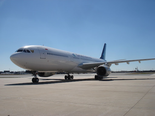
Sri Lankan v. Garuda Indonesia: You know, I really enjoy my job as the decider of the best color scheme among flag carriers, but this is getting ridiculous. Two more white-based schemes - who would have guessed? Coming up with reasons to pick one over the other is getting to be like coming up with reasons to pick between milanesa and gnocchi for dinner. In this match, it comes down to this: I like blue, Garuda has blue.
WINNER: Garuda Indonesia. 
Korean Air v. Ariana: My readers will no doubt recall that I am a fan of the baby-blue. Maybe it's my birthday. Two airlines with baby-blue color schemes. Korean Air uses it as a base, Ariana as the highlights. In the end, we come to the tail designs, and while I enjoy the eagle-like design Ariana uses, it is, for all intents and purposes, a generic moniker. Korean Air employs a national symbol and rides it to the Bracket final.
WINNER: Korean Air.
BRACKET FINAL: Garuda Indonesia v. Korean Air: When a flag carrier uses a white-based color scheme, I half expect that the highlighting colors would be those of the national flag. Garuda uses blue, the flag uses red. Fail.
WINNER: Korean Air. 
So now, eight days later, it's time for the Regional Semifinals. The winners of the following matches play for the right to represent Asia in the BIG DANCE...That's what is keeping me going at this point.
Aeroflot v. Thai: You know, it is because of matches like this one that I get paid the big bucks. Here we have two airlines who flew (get it?) by the competition without serious challenge. Again, we have two airlines with similar approaches to their color scheme. Although I consider the Russian flag to be very handsomely displayed on Aeroflot, I keep coming back to the Thai logo. It is so elegant. And look at the strip of white separating the mid-fuselage stripes from the tail livery. Classy, indeed.
WINNER: Thai. 
JAL v. Korean Air: What a battle royale in the Orient. This semifinal pits two flag carriers with distinctly different approaches to their color scheme. While I have been highly laudatory of JAL's simple livery, upon further inspection I have concluded that the airline erred in not adding any sort of color to the engines. On a plane with four engines, such as a B747 or A340, that just leaves too much white. After looking at Korean Air's color scheme again, I find it even more appealing. Look at the dark blue lettering and the light gray highlight under the baby blue. Well done, Korea.
WINNER: Korean Air. 
And now, finally, we have reached the Asian Regional Final. Drumroll, please.
THE FINAL:
Thai v. Korean Air: I admit it. The pressure of finding small details on which to base my decisions has become increasingly more difficult as this regional has progressed. I have poured over hundreds of samples of both of these color schemes and it became nearly impossible to find major flaws that would concede victory to the opponent. Eventually, I found this document which aided my decision-making process:

Baby blue is good on a plane, it is not good on a flight attendant. Suddenly, I am not so hot on the baby blue anymore. And I keep going back to Thai's logo. It is captivating. Each glance I get of it compells me to want to look even closer. Secretly, I think that Thai's color scheme is the color scheme embodiment of a certain environmental lobbyist I know who not only looks great in purple, but also really likes the fleur-de-lis. In the end, perhaps it was not fair to the rest of the field that Thai's color scheme had a hold over my heart. But, for the record, let's just say that Thai won because their color scheme looks better on flight attendants. WINNER: Thai.

See you at the dance...

 I stopped by this morning on my way to work and told her that tonight we would be playing Microsoft Flight Simulator all night. She licked herself and left the room.
 When choosing my destinations, I have two general rules:
 I used to run a flight to Detroit, MI but I have stopped primarily because there are no distinguishing landmarks in "cyber Detroit" to guide me to the major airports. With better visual cues, that would be a great flight, because I used to do it in around 45 minutes and Wayne County Airport is a lot of fun to land on.
 Maybe my cuddly co-pilot will convince me to visit our other neighboring country: Afghanistan.

 Aeroparque, as it is colloquially known in Argentina, handles all domestic and Uruguayan air traffic in Buenos Aires. It is downtown, adjacent to the Rio de la Plata, which, coincidentally, is the widest river in the world.
 You also get a great view of the city known as the


 The Republican candidate's plane, on the other hand, seems to be a flying monument to Senator McCain's ego. The tail and fuselage livery make it unequivocally clear that this campaign is about the person and not the ideas of the GOP. I suppose I do not blame them entirely for that - I would not want to run on their ideas either.
 Then, on the way back from a month-long backpacking trip in Europe, I was strolling around Frankfurt am Main International Airport with my travel buddies when we stumbled across a shop with a basket full of toy airplanes. I only bought four of them (because that's all I could afford at the time after having spent a month in Europe) but look out if I ever fly through there again.
 The other three Frankfurt-based purchases were a hometown

 Then, following perhaps the only real temper tantrum that I have thrown, I convinced my sister to buy me this model
 I cannot help but wonder what the gf thought when she first walked into my apartment and saw all my toy airplanes. But, I was prepared with this strategy: I immediately bombarded her with tales of days on the
  I was part of the registration team, and although we operated smoothly enough, at dinner the topic of discussion was ways to make improvements for next year. Of course, the
  Another issue that came up was that some riders did not have their USAC license with them, which is required for racing. One memorable female (?) rider came up and said, "I don't have my license, but here is my license number - I wrote it on my hand." This begs the question: If you are willing to take the time to grab a pen, take out your license, scrupulously copy the number on your hand, then why are you not willing to stick said license in your wallet and bring it with you to the race?
 We'll even let them keep their shoes on.


 (8)
(8)  (6) Yemenia v. (14) Oman Air: Although I remain a big fan of the gold and blue combination on Oman, I have come to realize that the design is a bit too erratic. There seems to be very little rhyme or reason to it. Yemenia is neat and professional. This is a white-based scheme gone right. WINNER: Yemenia.